# React Awesome Slider v3 [NEW fullpage navigation HOC]
[](https://travis-ci.org/rcaferati/react-awesome-slider) 
`react-awesome-slider` is a 60fps, extendable, highly customizable, production ready React Component that renders a media (image/video) gallery slider/carousel.
## FULLPAGE navigation HOC
For using the full-screen navigation HOCs please checkout the `GatsbyJS` and `NextJS` examples on the [ras fullpage strategies repository](https://github.com/rcaferati/ras-fullpage-strategies).
You can access the demo for the FULLPAGE navigation here: [fullpage.caferati.me](https://fullpage.caferati.me)
[ ](https://fullpage.caferati.me/)
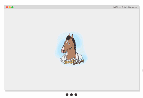
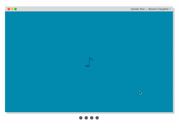
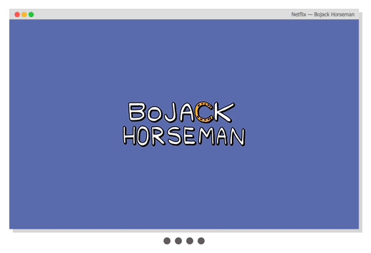
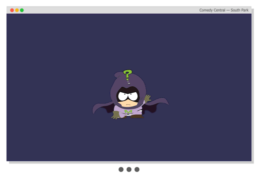
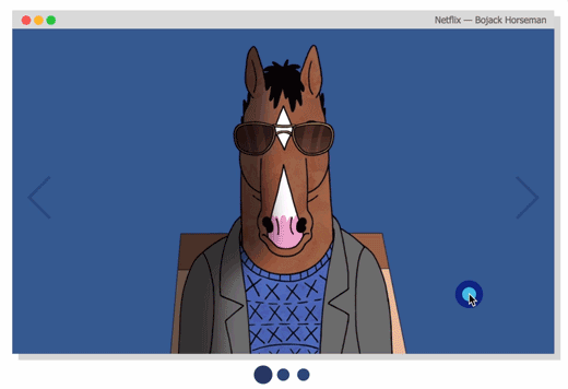
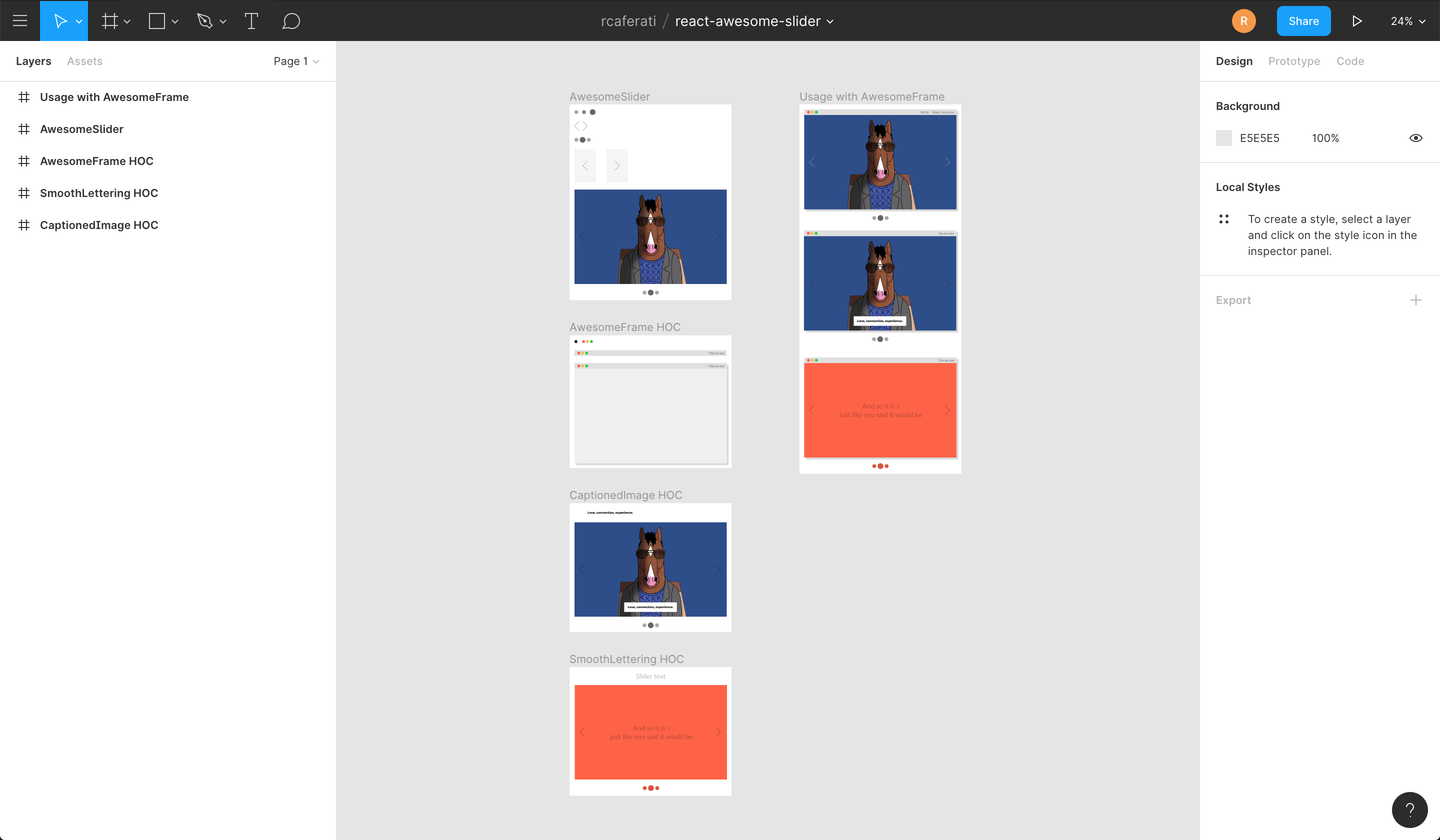
## Basic usage
[
](https://fullpage.caferati.me/)
## Basic usage
[ ](https://caferati.me/demo/react-awesome-slider)
[
](https://caferati.me/demo/react-awesome-slider)
[ ](https://caferati.me/demo/react-awesome-slider)
### Basic usage with pure CSS
```jsx
import AwesomeSlider from 'react-awesome-slider';
import 'react-awesome-slider/dist/styles.css';
const slider = (
](https://caferati.me/demo/react-awesome-slider)
### Basic usage with pure CSS
```jsx
import AwesomeSlider from 'react-awesome-slider';
import 'react-awesome-slider/dist/styles.css';
const slider = (
1
2
3
4
);
```
## Animation recipes: scale-out, fold-out, cube, open and fall.
For analysing how the animations are built, please check out to [this folder](https://github.com/rcaferati/react-awesome-slider/tree/master/src/styled). Collaborations with new creative ones are welcome, just open a PR.
[ ](https://caferati.me/demo/react-awesome-slider)
[
](https://caferati.me/demo/react-awesome-slider)
[ ](https://caferati.me/demo/react-awesome-slider)
[
](https://caferati.me/demo/react-awesome-slider)
[ ](https://caferati.me/demo/react-awesome-slider)
[
](https://caferati.me/demo/react-awesome-slider)
[ ](https://caferati.me/demo/react-awesome-slider)
### Cube animation recipe
Checkout more recipes on the styled folder. For more animation recipes check out the [styled folder](https://github.com/rcaferati/react-awesome-slider/tree/master/src/styled).
```jsx
import AwesomeSlider from 'react-awesome-slider';
import 'react-awesome-slider/dist/custom-animations/cube-animation.css';
const slider = (
);
```
### Touch enabled
[
](https://caferati.me/demo/react-awesome-slider)
### Cube animation recipe
Checkout more recipes on the styled folder. For more animation recipes check out the [styled folder](https://github.com/rcaferati/react-awesome-slider/tree/master/src/styled).
```jsx
import AwesomeSlider from 'react-awesome-slider';
import 'react-awesome-slider/dist/custom-animations/cube-animation.css';
const slider = (
);
```
### Touch enabled
[ ](https://caferati.me/demo/react-awesome-slider)
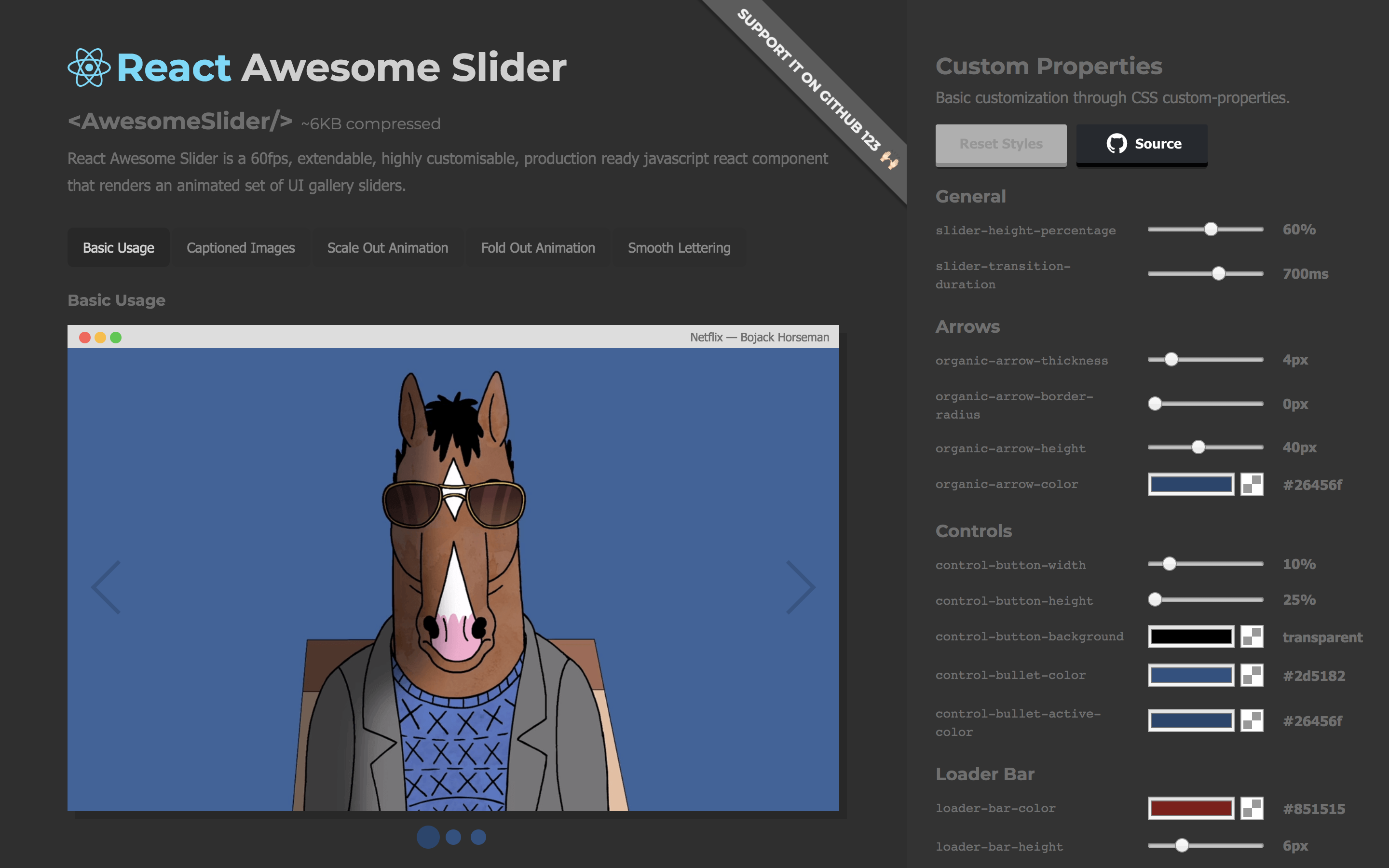
## Live demo
Checkout the `CSS customizer` at my portfolio
[
](https://caferati.me/demo/react-awesome-slider)
## Live demo
Checkout the `CSS customizer` at my portfolio
[ ](https://caferati.me/demo/react-awesome-slider)
## Figma File
Import the component directly into your [Figma](https://www.figma.com/file/VItcmlJtKZxyGJhClk4Lg0kQ/react-awesome-slider) project.
[
](https://caferati.me/demo/react-awesome-slider)
## Figma File
Import the component directly into your [Figma](https://www.figma.com/file/VItcmlJtKZxyGJhClk4Lg0kQ/react-awesome-slider) project.
[ ](https://www.figma.com/file/VItcmlJtKZxyGJhClk4Lg0kQ/react-awesome-slider)
### Installing
```
npm install --save react-awesome-slider
```
or
```
yarn add react-awesome-slider
```
## More Examples
### Basic usage with Media object
```jsx
import AwesomeSlider from 'react-awesome-slider';
import 'react-awesome-slider/dist/styles.css';
const slider = (
);
```
### Basic usage with CSS Modules
```jsx
import AwesomeSlider from 'react-awesome-slider';
import AwesomeSliderStyles from 'react-awesome-slider/src/styles';
const slider = (
);
```
### Fold-out animation recipe with CSS Modules
Checkout more recipes on the styled folder. For more animation recipes check out the [styled folder](https://github.com/rcaferati/react-awesome-slider/tree/master/src/styled).
Note that on v3 there's an adition of the `animation` prop. The animation name is the cammel-cased version of the animation css file.
```jsx
import AwesomeSlider from 'react-awesome-slider';
import CoreStyles from 'react-awesome-slider/src/core/styles.scss';
import AnimationStyles from 'react-awesome-slider/src/styled/fold-out-animation/fold-out-animation.scss';
const slider = (
);
```
### Using the Autoplay HOC with plain CSS
```jsx
import AwesomeSlider from 'react-awesome-slider';
import withAutoplay from 'react-awesome-slider/dist/autoplay';
import 'react-awesome-slider/dist/styles.css';
const AutoplaySlider = withAutoplay(AwesomeSlider);
const slider = (
);
```
### Using the Captioned HOC with plain CSS
```jsx
import AwesomeSlider from 'react-awesome-slider';
import withCaption from 'react-awesome-slider/dist/captioned';
import 'react-awesome-slider/dist/styles.css';
import 'react-awesome-slider/dist/captioned.css';
const CaptionedSlider = withCaption(AwesomeSlider);
const component = (
);
```
## Key Features
- Look and feel customisable and extendable via SASS and CSS Variables ([custom-properties](https://github.com/rcaferati/react-awesome-slider/blob/master/src/core/styles.scss#L48)) ([scss main file](https://github.com/rcaferati/react-awesome-slider/blob/master/src/core/styles.scss))
- Media pre-loader
- Touch enabled
- 60fps animations
- Animated transition recipes
- Extendable via custom plugin HOC components
- FullScreen achieved through the `fillParent` prop
## Main Props
| Attributes | Type | Default | Description |
| :------------------ | :--------: | :--------------: | :--------------------------------------------------------------------------------------------------------------------------------------------------- |
| className | `string` | `null` | Add a className to the component container |
| cssModule | `object` | `null` | CSS Module object if you choose to use this styling approach |
| name | `string` | `awesome-slider` | Unique name of the rendered slider. Useful if you're navigating between multiple pages that contains a slider component. |
| selected | `number` | `0` | Sets the current active/selected screen |
| bullets | `boolean` | `true` | When set to true show the bullet controls underneath the slider |
| organicArrows | `boolean` | `true` | When set to true show the organic arrow `next` and `prev` controls |
| fillParent | `boolean` | `false` | When set to true the slider will fill the dimensions of the parent element. Usefull for using it in full-screen mode. |
| infinite | `boolean` | `true` | When set to true the slider will behave on an infinite fashion returing to the first slide after the last one. |
| startupScreen | `node` | `null` | Set's the startup screen component to be shown before the first screen is loaded. It works like a pre-loading screen. |
| startup | `boolean` | `true` | Used together with `startupScreen` controls whether or not the startupScreen should auto-start. |
| transitionDelay | `number` | `0` | Sets a delay in `ms` between the slide transitions. Useful if you're waiting for an exit animation to finish in the current slide. |
| mobileTouch | `boolean` | `true` | When set to true activates a swipe touch effect to navigate on mobile devices. |
| buttons | `boolean` | `true` | Should render the default left and right navigation buttons. |
| buttonContentRight | `node` | `null` | Add content as children of the right button. |
| buttonContentLeft | `node` | `null` | Add content as children of the left button. |
| customContent | `node` | `null` | Render extra content at the same level of the default buttons. Useful if you want to add an extra slider navigation layer or a fixed overlay element |
| onFirstMount | `function` | `null` | Called on componentDidMount passing the slider reference as an argument |
| onTransitionEnd | `function` | `null` | Called on at the slider transition end event passing the slider reference as an argument |
| onTransitionStart | `function` | `null` | Called on slider transition start passing the slider reference as an argument |
| onTransitionRequest | `function` | `null` | Called when a user interacts with the slider navigation (arrows or bullets) |
## Contribute
If you have an idea for a missing feature or animation just craft your own `hoc feature` or `animation style` and send it up via PR to the `src/components` folder.
## Author
#### Rafael Caferati
- Checkout my Web Developer Portfolio Website
- Other open source projects @ Code Laboratory
- A scope of my work @ Web Developer Portfolio
## License
MIT. Copyright (c) 2018 Rafael Caferati.
](https://www.figma.com/file/VItcmlJtKZxyGJhClk4Lg0kQ/react-awesome-slider)
### Installing
```
npm install --save react-awesome-slider
```
or
```
yarn add react-awesome-slider
```
## More Examples
### Basic usage with Media object
```jsx
import AwesomeSlider from 'react-awesome-slider';
import 'react-awesome-slider/dist/styles.css';
const slider = (
);
```
### Basic usage with CSS Modules
```jsx
import AwesomeSlider from 'react-awesome-slider';
import AwesomeSliderStyles from 'react-awesome-slider/src/styles';
const slider = (
);
```
### Fold-out animation recipe with CSS Modules
Checkout more recipes on the styled folder. For more animation recipes check out the [styled folder](https://github.com/rcaferati/react-awesome-slider/tree/master/src/styled).
Note that on v3 there's an adition of the `animation` prop. The animation name is the cammel-cased version of the animation css file.
```jsx
import AwesomeSlider from 'react-awesome-slider';
import CoreStyles from 'react-awesome-slider/src/core/styles.scss';
import AnimationStyles from 'react-awesome-slider/src/styled/fold-out-animation/fold-out-animation.scss';
const slider = (
);
```
### Using the Autoplay HOC with plain CSS
```jsx
import AwesomeSlider from 'react-awesome-slider';
import withAutoplay from 'react-awesome-slider/dist/autoplay';
import 'react-awesome-slider/dist/styles.css';
const AutoplaySlider = withAutoplay(AwesomeSlider);
const slider = (
);
```
### Using the Captioned HOC with plain CSS
```jsx
import AwesomeSlider from 'react-awesome-slider';
import withCaption from 'react-awesome-slider/dist/captioned';
import 'react-awesome-slider/dist/styles.css';
import 'react-awesome-slider/dist/captioned.css';
const CaptionedSlider = withCaption(AwesomeSlider);
const component = (
);
```
## Key Features
- Look and feel customisable and extendable via SASS and CSS Variables ([custom-properties](https://github.com/rcaferati/react-awesome-slider/blob/master/src/core/styles.scss#L48)) ([scss main file](https://github.com/rcaferati/react-awesome-slider/blob/master/src/core/styles.scss))
- Media pre-loader
- Touch enabled
- 60fps animations
- Animated transition recipes
- Extendable via custom plugin HOC components
- FullScreen achieved through the `fillParent` prop
## Main Props
| Attributes | Type | Default | Description |
| :------------------ | :--------: | :--------------: | :--------------------------------------------------------------------------------------------------------------------------------------------------- |
| className | `string` | `null` | Add a className to the component container |
| cssModule | `object` | `null` | CSS Module object if you choose to use this styling approach |
| name | `string` | `awesome-slider` | Unique name of the rendered slider. Useful if you're navigating between multiple pages that contains a slider component. |
| selected | `number` | `0` | Sets the current active/selected screen |
| bullets | `boolean` | `true` | When set to true show the bullet controls underneath the slider |
| organicArrows | `boolean` | `true` | When set to true show the organic arrow `next` and `prev` controls |
| fillParent | `boolean` | `false` | When set to true the slider will fill the dimensions of the parent element. Usefull for using it in full-screen mode. |
| infinite | `boolean` | `true` | When set to true the slider will behave on an infinite fashion returing to the first slide after the last one. |
| startupScreen | `node` | `null` | Set's the startup screen component to be shown before the first screen is loaded. It works like a pre-loading screen. |
| startup | `boolean` | `true` | Used together with `startupScreen` controls whether or not the startupScreen should auto-start. |
| transitionDelay | `number` | `0` | Sets a delay in `ms` between the slide transitions. Useful if you're waiting for an exit animation to finish in the current slide. |
| mobileTouch | `boolean` | `true` | When set to true activates a swipe touch effect to navigate on mobile devices. |
| buttons | `boolean` | `true` | Should render the default left and right navigation buttons. |
| buttonContentRight | `node` | `null` | Add content as children of the right button. |
| buttonContentLeft | `node` | `null` | Add content as children of the left button. |
| customContent | `node` | `null` | Render extra content at the same level of the default buttons. Useful if you want to add an extra slider navigation layer or a fixed overlay element |
| onFirstMount | `function` | `null` | Called on componentDidMount passing the slider reference as an argument |
| onTransitionEnd | `function` | `null` | Called on at the slider transition end event passing the slider reference as an argument |
| onTransitionStart | `function` | `null` | Called on slider transition start passing the slider reference as an argument |
| onTransitionRequest | `function` | `null` | Called when a user interacts with the slider navigation (arrows or bullets) |
## Contribute
If you have an idea for a missing feature or animation just craft your own `hoc feature` or `animation style` and send it up via PR to the `src/components` folder.
## Author
#### Rafael Caferati
- Checkout my Web Developer Portfolio Website
- Other open source projects @ Code Laboratory
- A scope of my work @ Web Developer Portfolio
## License
MIT. Copyright (c) 2018 Rafael Caferati.