# Embeds
This theme ships some embeds that hide the complexity of rendering the same elements over and over again with the correct HTML.
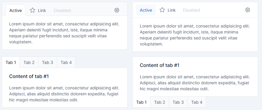
## Card navigation
Card nav has been implemented.
### Parameters
`Card navigation` embed, can be used with 4 parameters:
| Parameter | Description | Type | Default |
|:---------:|------------------------------------------------------------------------|:---------:|:-------:|
| items | Array of [Item](#Item) | `array` | `[]` |
| tabs | Use `card` for each tab content instead one single card | `bool` | `false` |
| bottom | _Only if `tabs` is `true`_ Set the tabs navigations at the bottom | `boolean` | `false` |
| pills | Use `pills` as tab style | `bool` | `false` |
#### Item
> Note:
> If `url` parameter is not specified, Boostrap tab navigation will be used to navigate trough elements.
> If `url` is specified, click on tab will simply redirect to the URL.
| Parameter | Description | Type | Default |
|:---------:|------------------------------------------|:---------:|:-------------------------------:|
| id | Id of item (used for bootstrap tab) | `string` | `tabler_unique_id()` |
| name | Name of the item | `string` | _empty string_ |
| content | Content of the item | `string` | _empty string_ |
| active | Set the item as currently active | `boolean` | `false` |
| disabled | Set the item as disabled | `boolean` | `false` |
| url | Href of the `a` link in the menu | `string` | `#tabs-` + `tabler_unique_id()` |
| raw | Render item name AND content as RAW HTML | `boolean` | `false` |
### Content
`Card navigation` embed, has 1 common block:
| Block | Description |
|:------------:|-------------------------------------------------------------|
| card_content | Will replace the content autocomplete from Items -> content |
See twig file for more blocks, which allow customization of HTML tags, CSS classes and more.
### Usage
#### Full boostrap tabs
All content tab must be rendered
```twig
{% set raw_html_example %}
Active content
With some text
{% endset %}
{% set items = [
{
name : 'First',
content : 'First content',
},
{
name : 'Disabled',
content : 'Disabled content',
disabled : true,
raw : true,
},
{
name : 'Active',
content : raw_html_example,
active : true,
raw : true,
},
{
name : 'Url',
url : 'https://www.w3schools.com/',
},
] %}
{% embed '@Tabler/embeds/card_nav.html.twig' with { items : items, tabs : true} %}{% endembed %}
```
#### Url single content
Only one tab content is completed, rest is only for navigation between urls
```twig
{% set items = [
{
name: 'Account',
url: '/account'
},
{
name: 'Notifications',
url: '/notifications',
active: true,
},
{
name: 'Experience',
},
{
name: 'Feedback',
},
] %}
{% embed '@Tabler/embeds/card_nav.html.twig' with { items : items, tabs : true} %}
{% block card_content %}
Single page/tab content
I'm a content that will not be changed.
Even if you click tabs!
Useful when one tab correspond to one specifics URL
{% endblock %}
{% endembed %}
```
## Next steps
Please go back to the [Tabler bundle documentation](index.md) to find out more about using the theme.